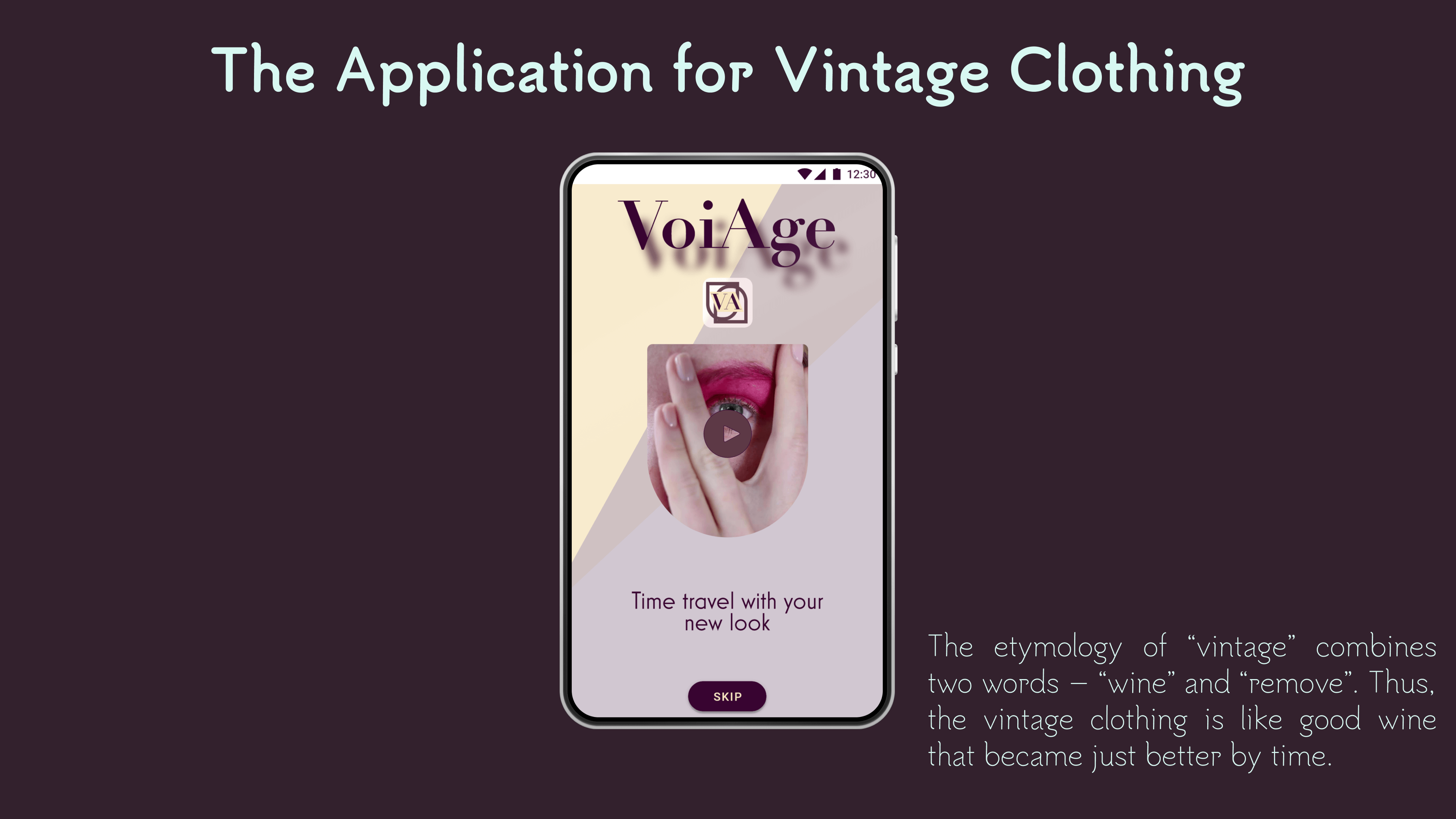
"VoiAge"
The app's name "VoiAge" has hidden meaning, as "voi" in Italian language (as one of the world fashion center's) means "you"; "Age" represents vintage; and in combination the word's pronunciation sounds like word "voyage" which means "journey" and "travel". The slogan of the app offers time travel in the fashion.
The Idea
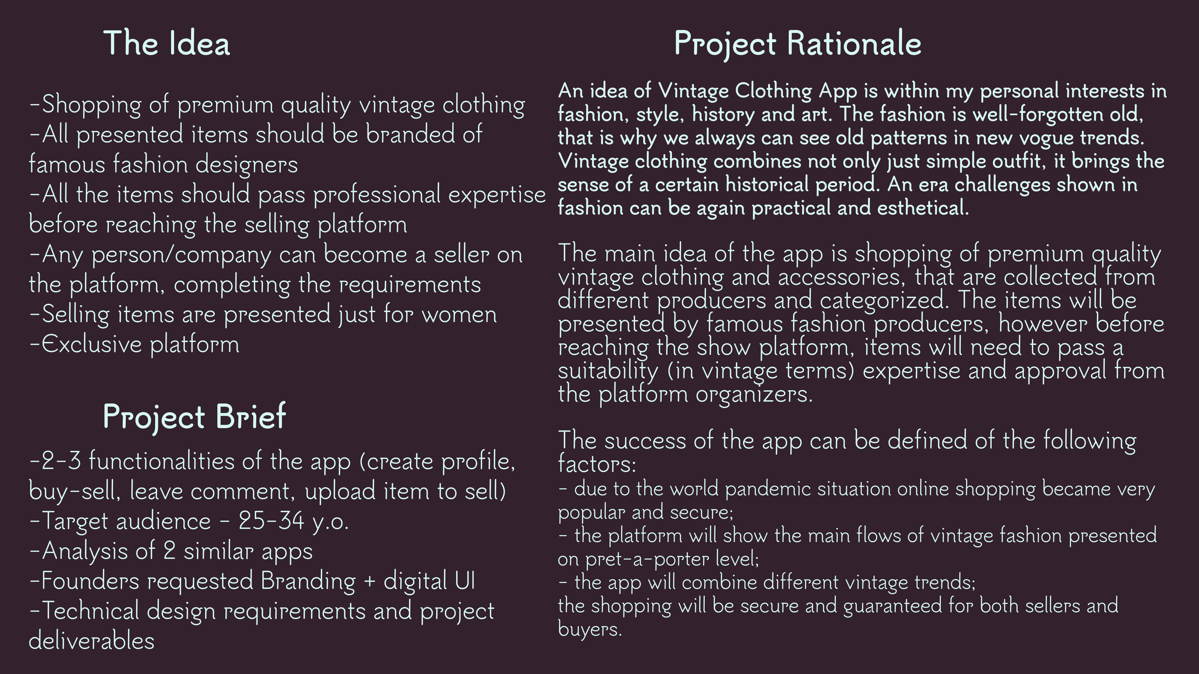
One of the project requirement was to build an online shop, so I came with the idea to create an application that would sell vintage clothing - as one of the current trends on the market. Along with the idea, I build the rationale, adjusting it to the project's brief.
Research
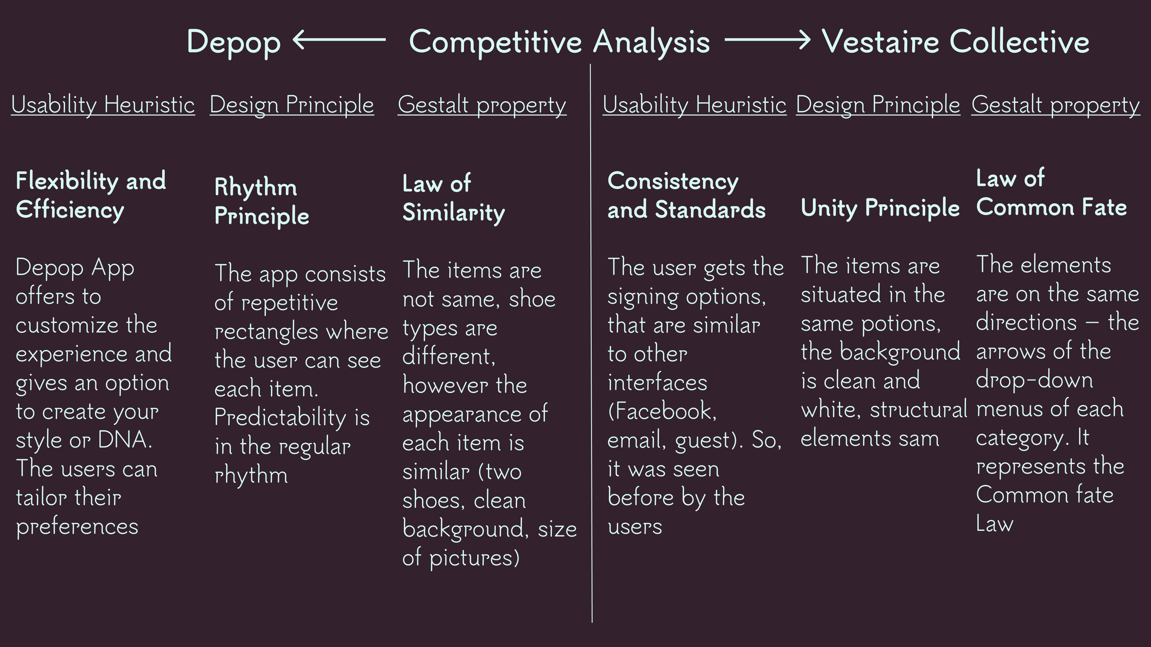
One of the important paces was conducting the Competitive analysis and research the structure, strong points and disadvantages of the similar applications popular on the market.
Design evolution
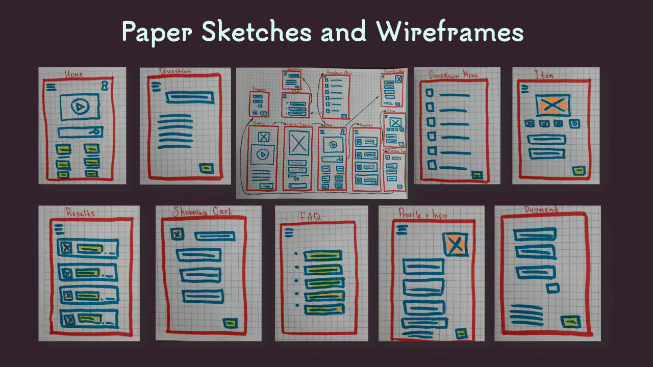
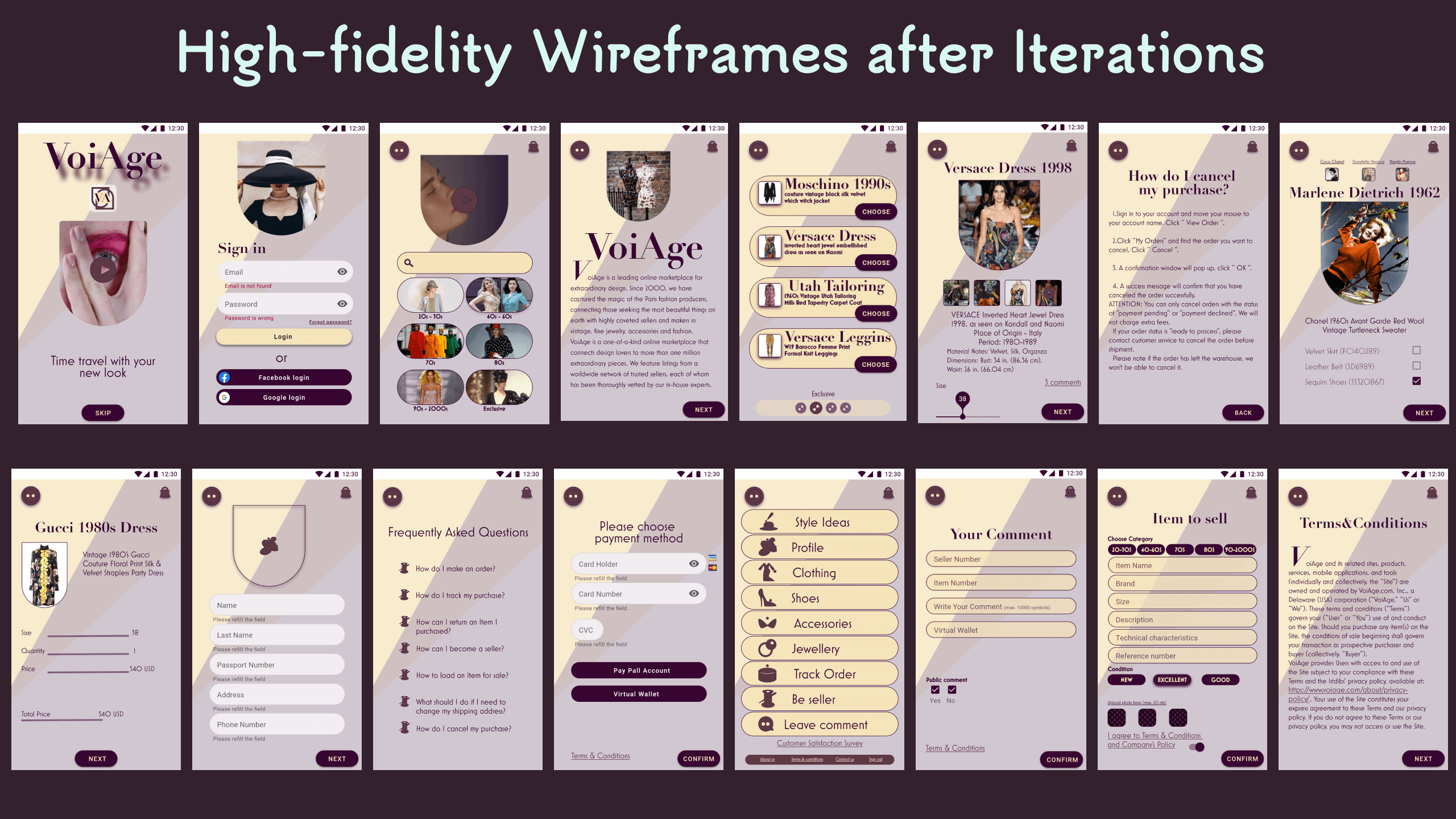
The next move of the project development was building the structure of the app, creating paper sketches, low-, middle- and high-fidelity wireframes. All these stages went through iterations, f.e. on the last wireframe you can see the changes of the style.
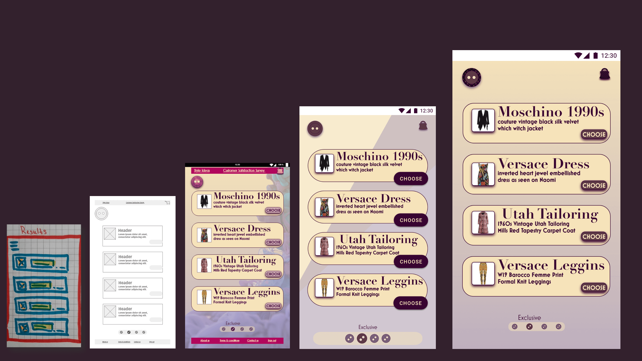
Here are the presentations of each step, described above, starting with paper sketches and low-fidelity wireframes.
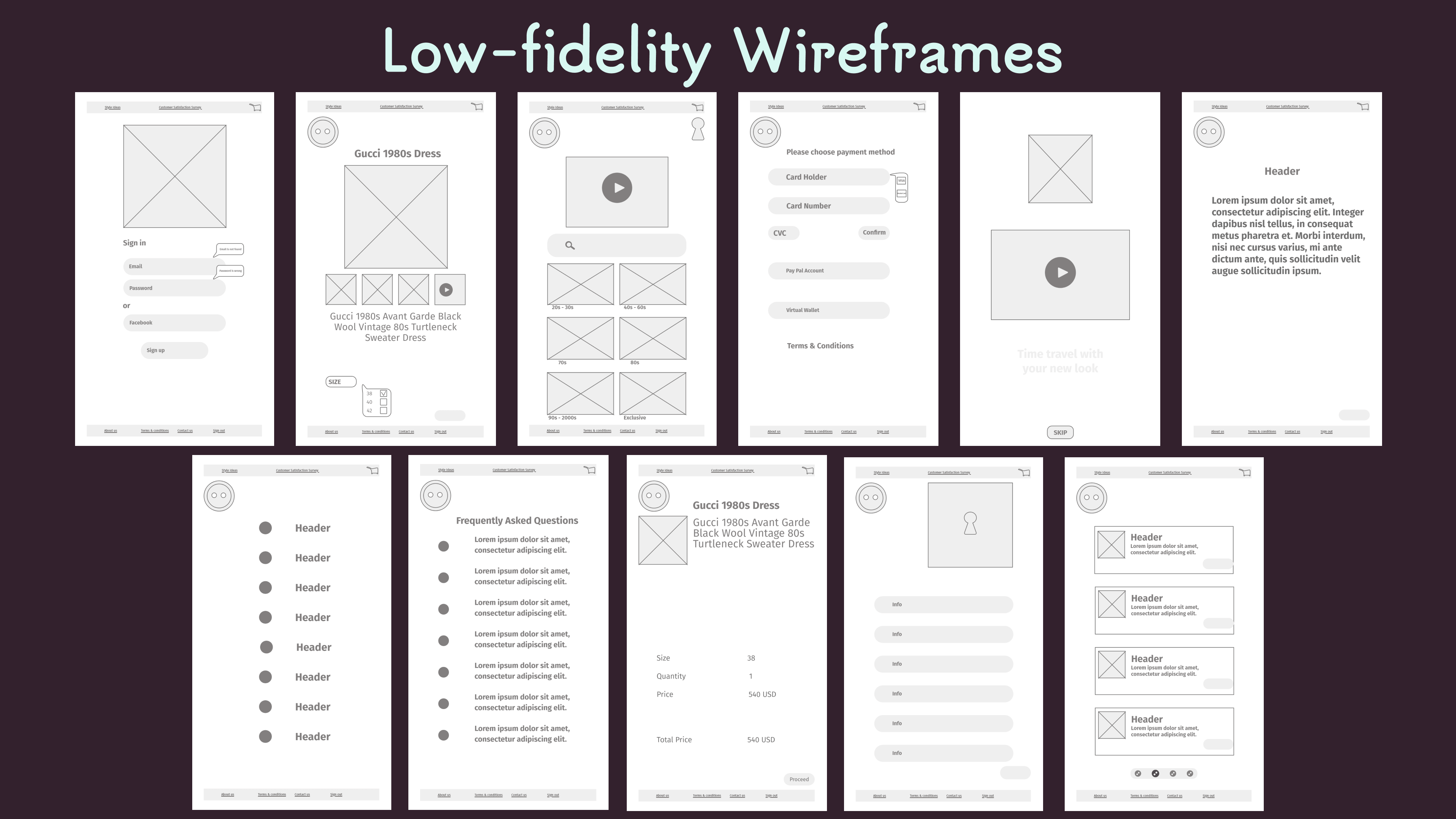
Low-fidelity wireframes were designed according to the app's grid and layout that would leave enough white space and make the interface understandable, comfortable for users, but at the same time chick and elegant.
The style
Choosing the style and moving to the decoration of the application was a real pleasure for me. The color palette evokes vintage, luxury, exclusive feelings and the icon set is created according to the app's concept.
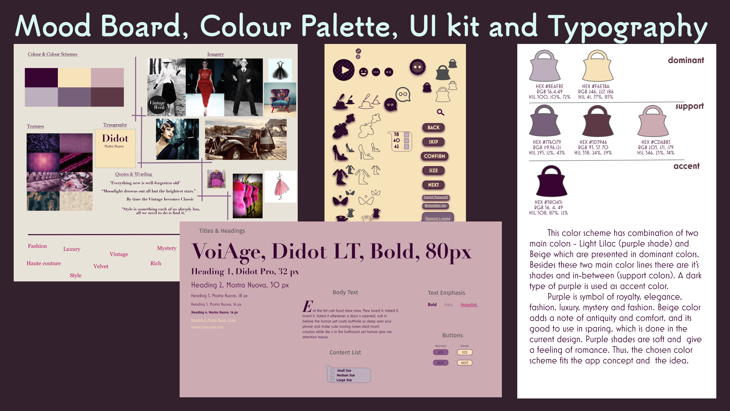
The next step was implementing the style into the app's interface. I used geometrical patterns for the background as one of the current trends in UI design.
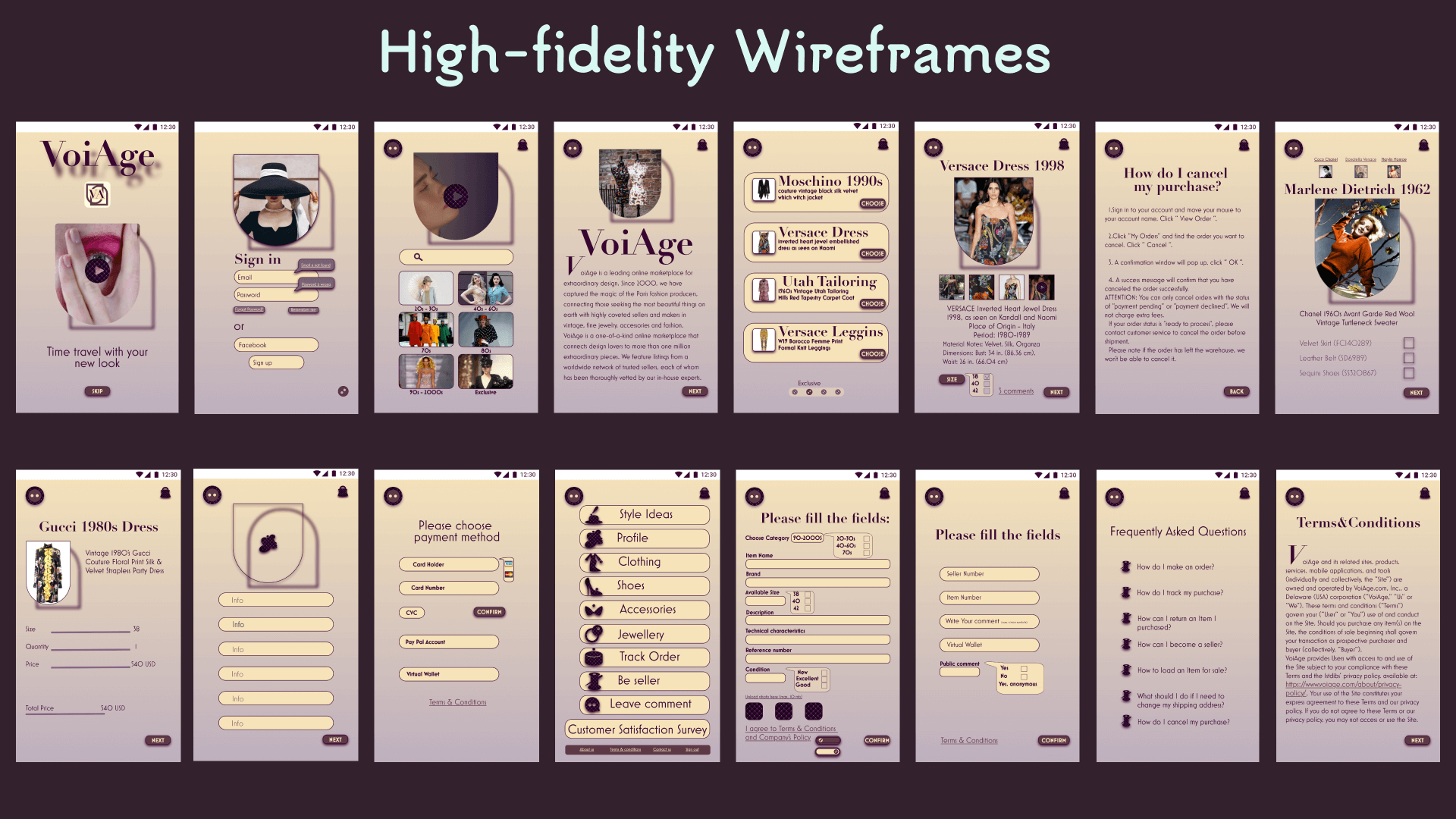
After testing the final result and reviewing the application with specialists, I came with the conclusion to change the visual style: Ui elements were changed according to Material Design requirements and the background became more soft and neutral.
My experience
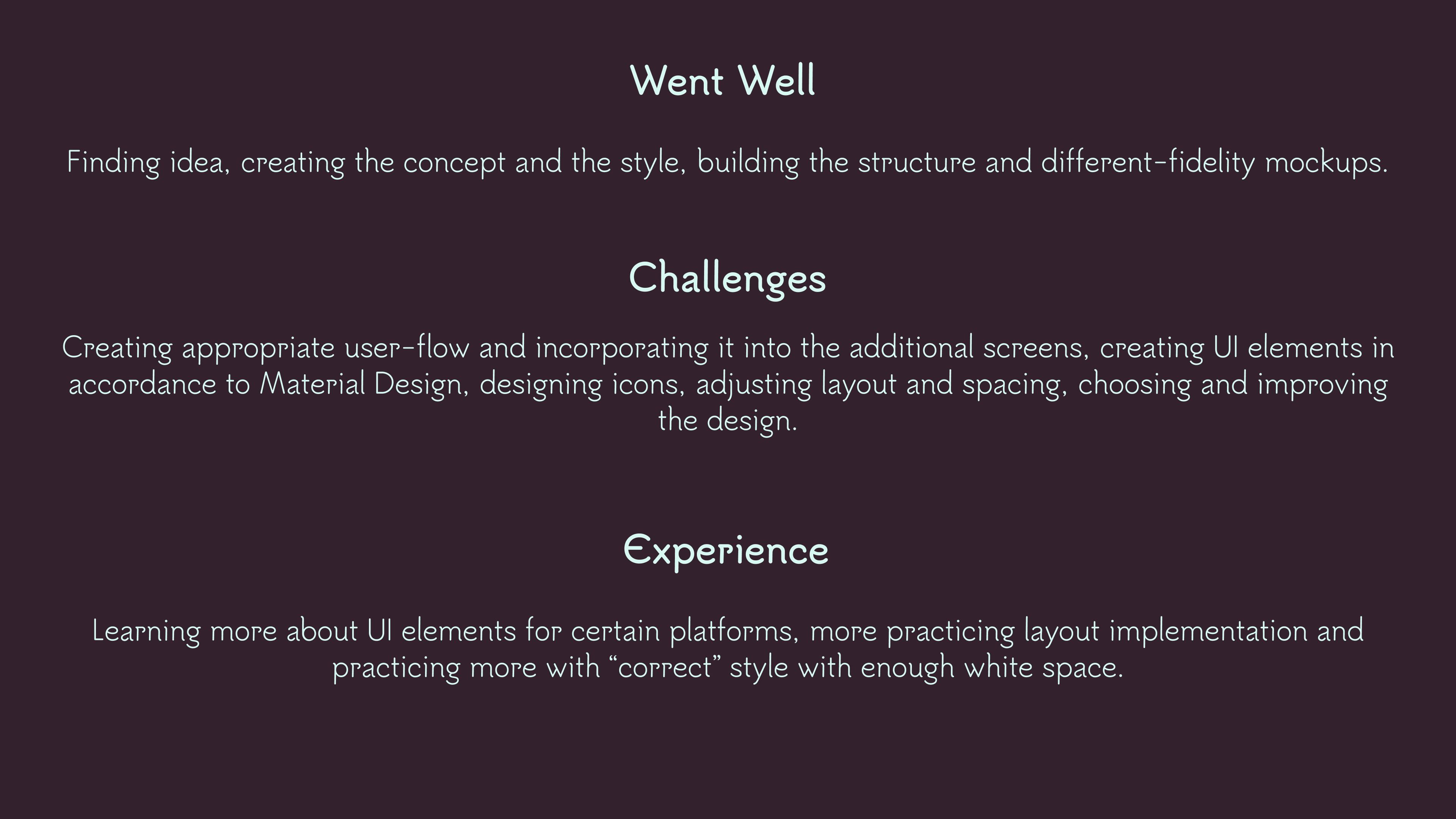
Below You can see my experience reflections - difficulties, positive incomes and future plans for self-development.
Visual effects
The video represents the application (also used in splash screen). The eye represents fashion look, the fingers repeat letter "V", which is the first letter of the app's name - "VioAge".
