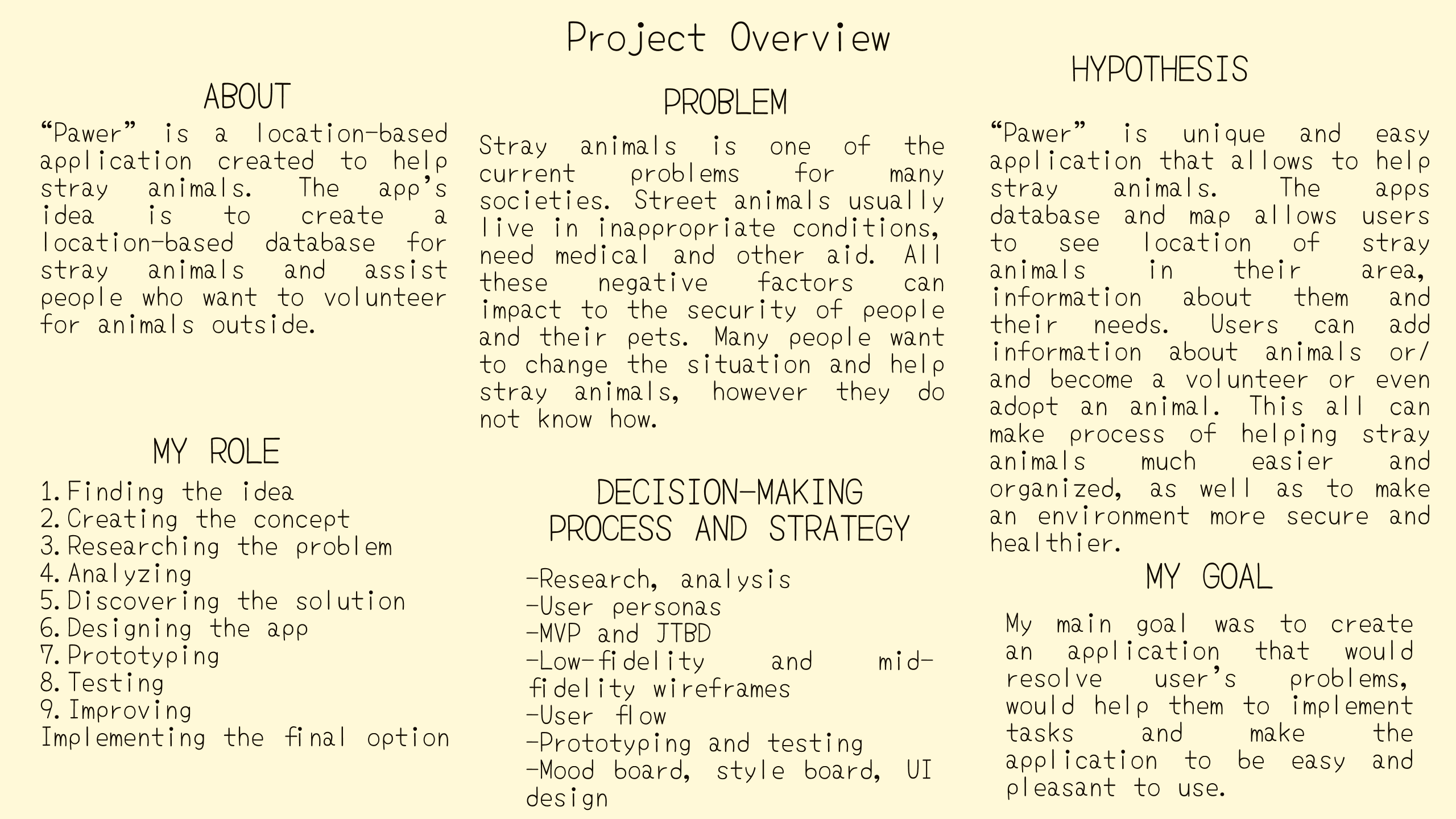
"Pawer"
The requirements of this project was to create a responsive location-based application. Thus, I came with the idea to create an application that would not only help humans, but also animals that live on the streets.
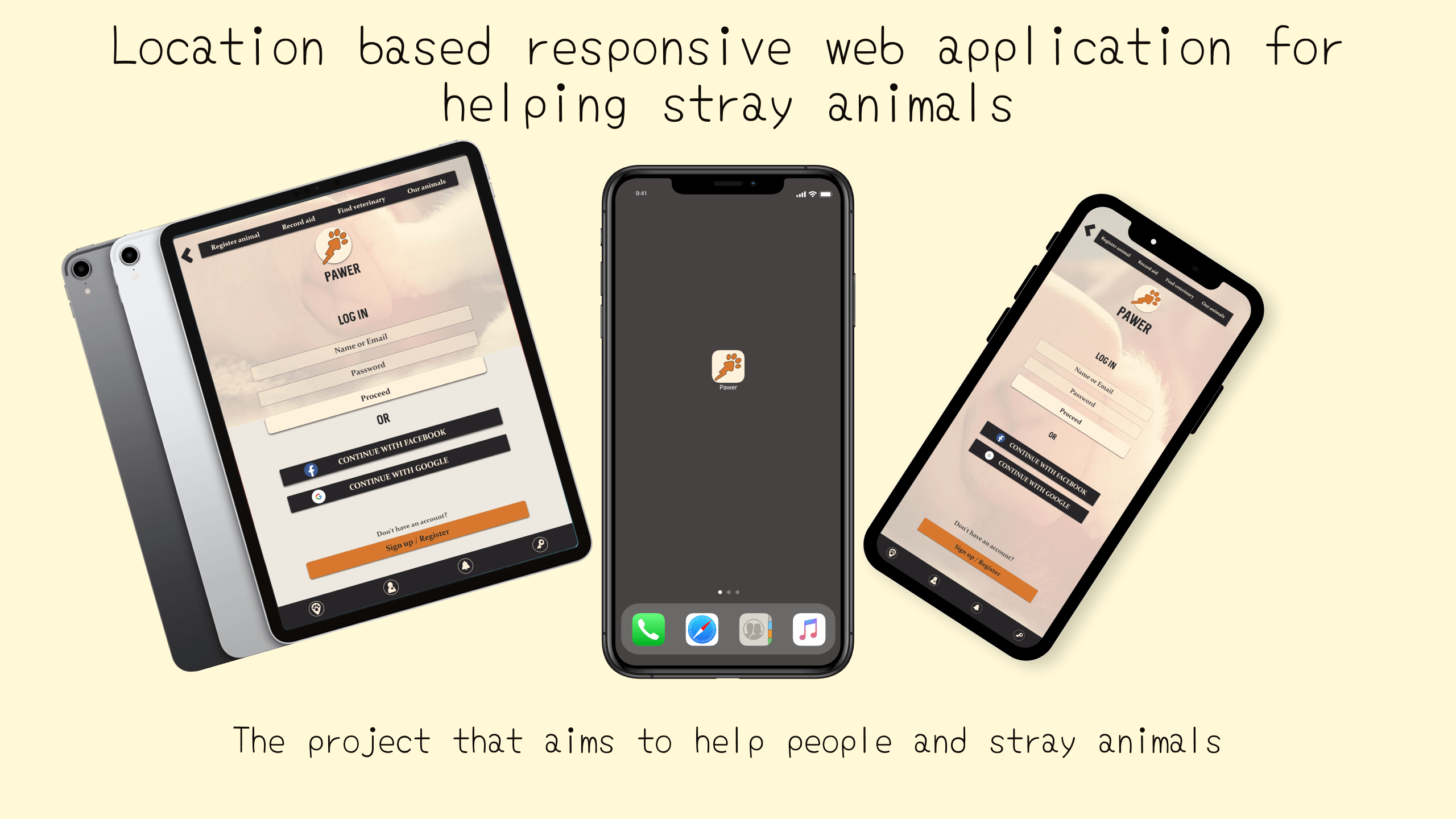
The main task of the application is to help people to take care of stray animals, which would make environment healthier and more secure.
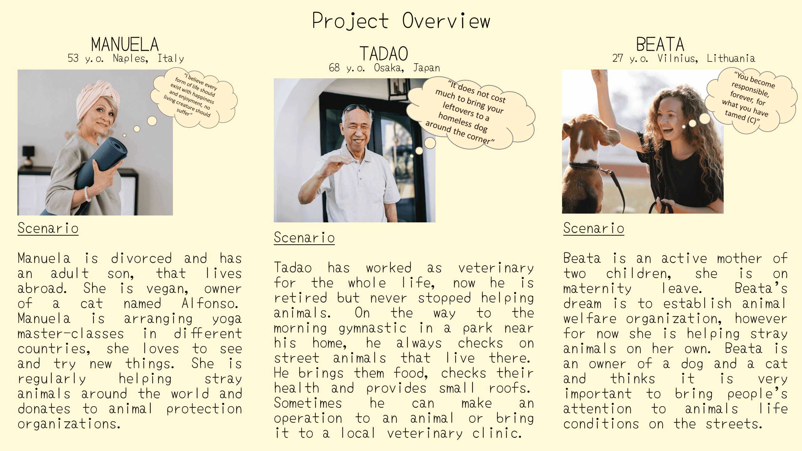
User Personas
After creating the concept, I worked on the next step - setting user personas - typical unreal personalities that would use the application.
Research
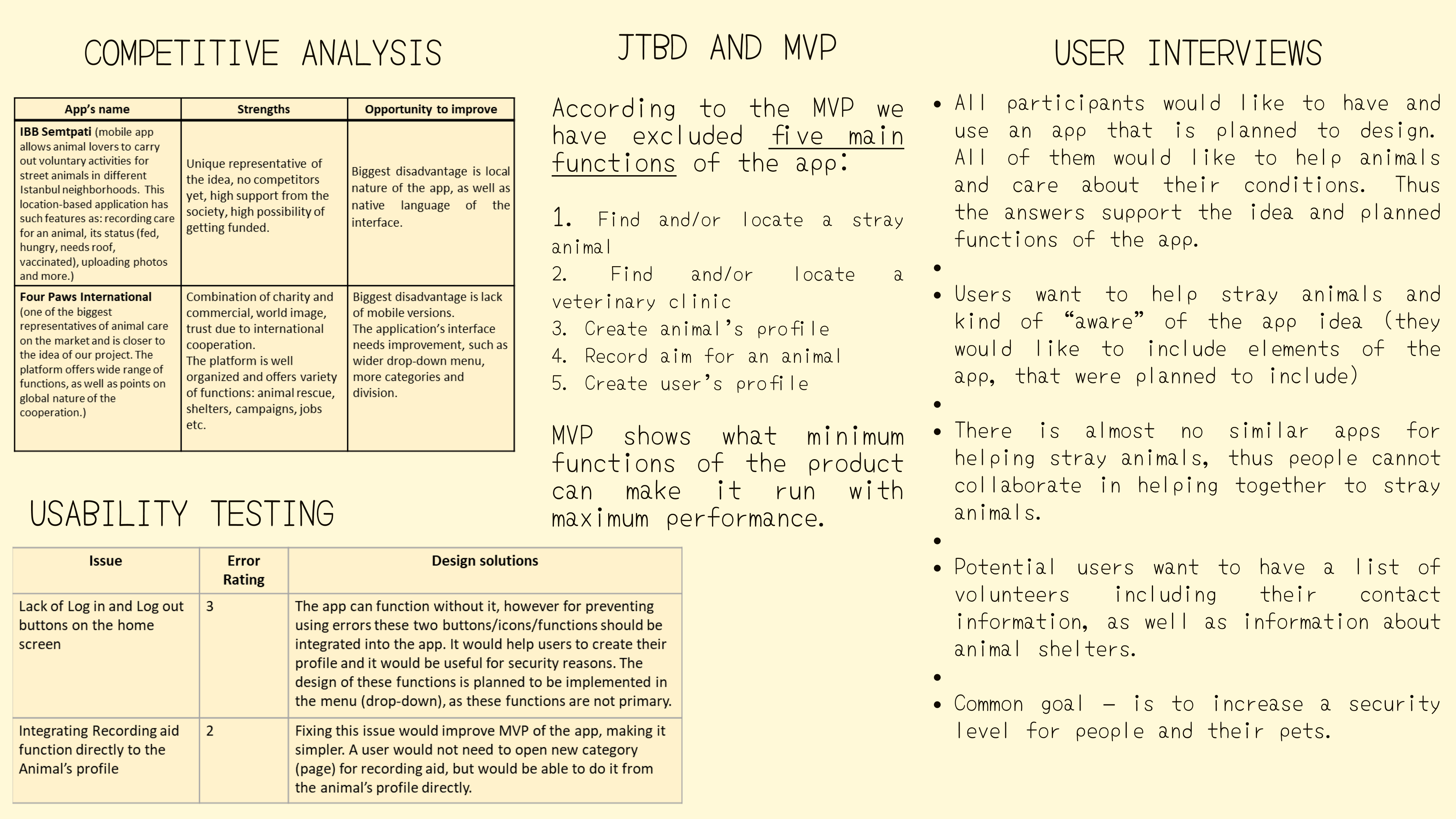
One of the important paces of the design is conducting tests and making the research - in order to define important points for the future application. I made a competitive analysis, researching and comparing similar applications on the market; user interviews and usability testing, that allowed me to proceed with the app's development.
User Experience
Below you can see results of the main steps for the UX design of this application.
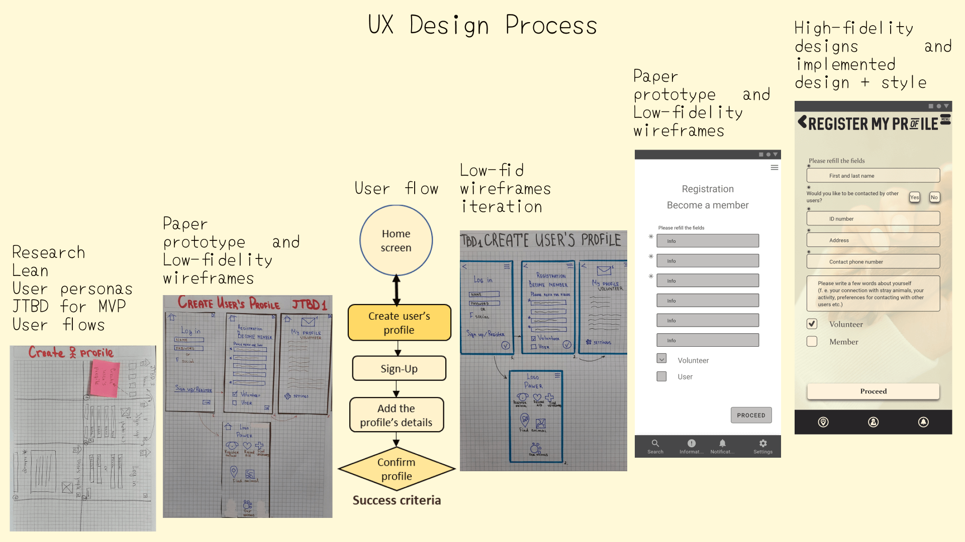
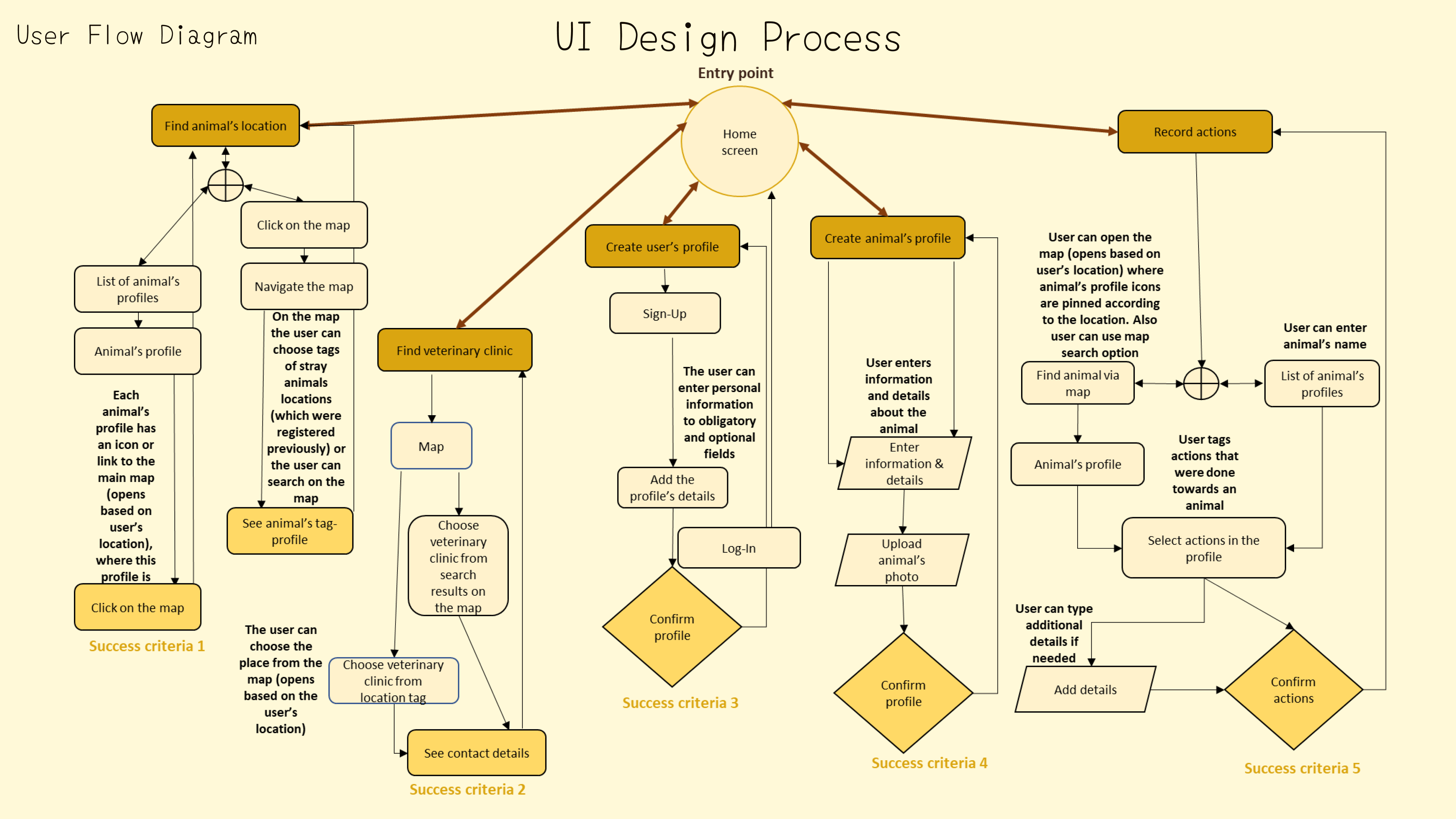
Next step was creating the user's flow and define key user-flows.
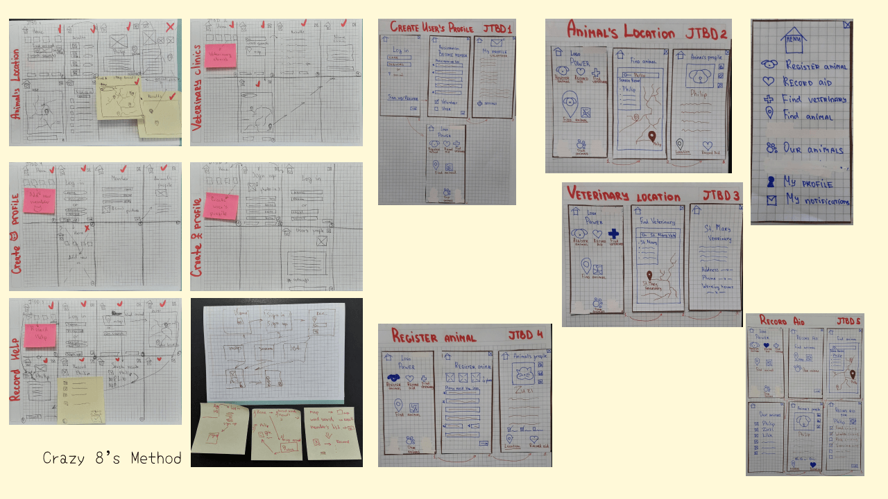
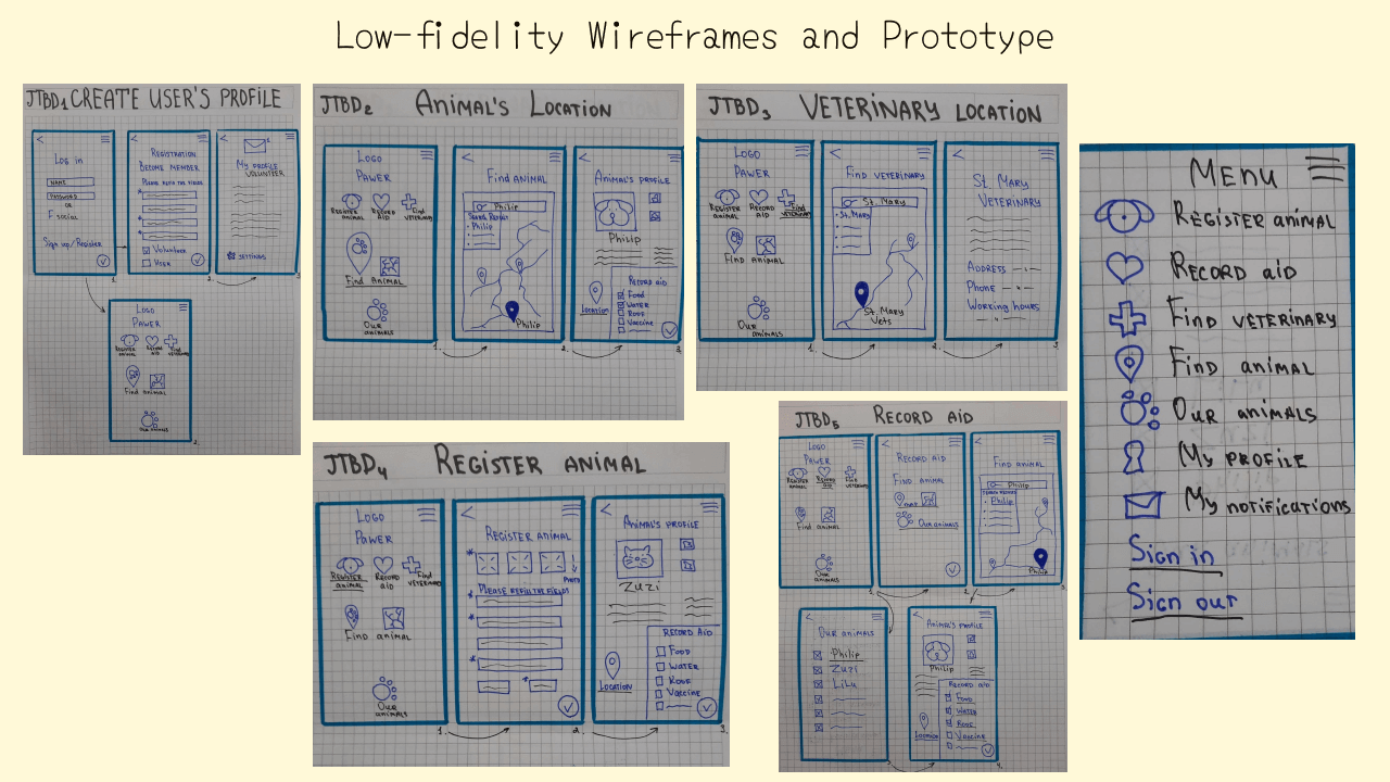
Exploratory sketches and paper prototypes helped to iterate the structure of the application and refine the app's categories.
User Interface and wireframes
Next step was building the low-fidelity wireframes, incorporating the UI elements, grids and layouts.
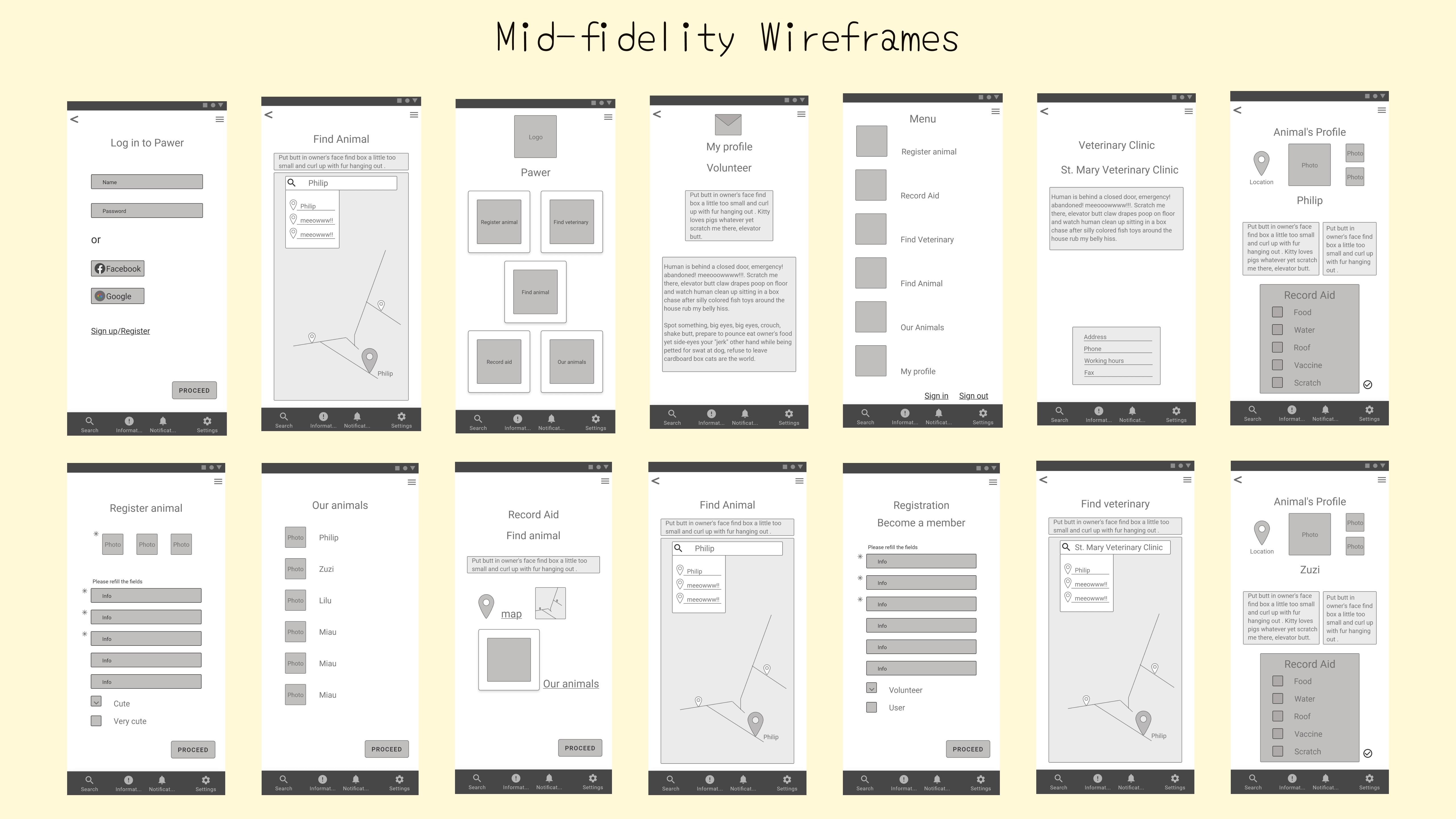
To come closer to the app's "real" look I created mid-fidelity wireframes for the main screens. This allowed me to review and iterate the user-flows, position of UI elements and the future design implementation.
Creating the style
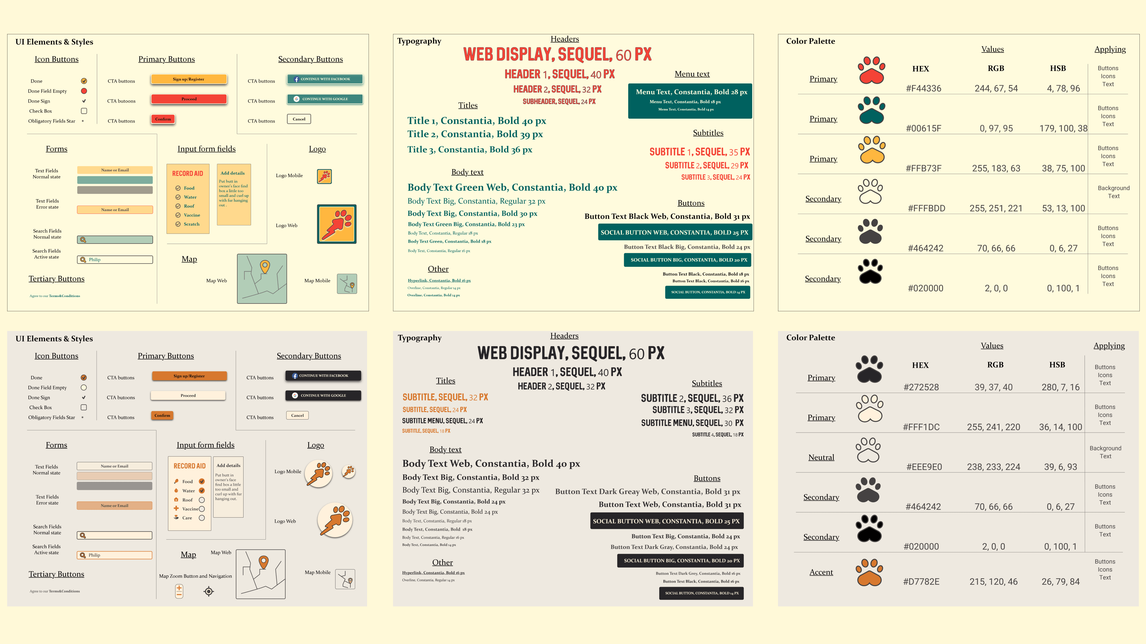
My favorite, but not less responsible, difficult and time-consuming step - creating the style! The main challenge here for me was designing UI components and then combining it all to the perfect full picture of the app's interface.
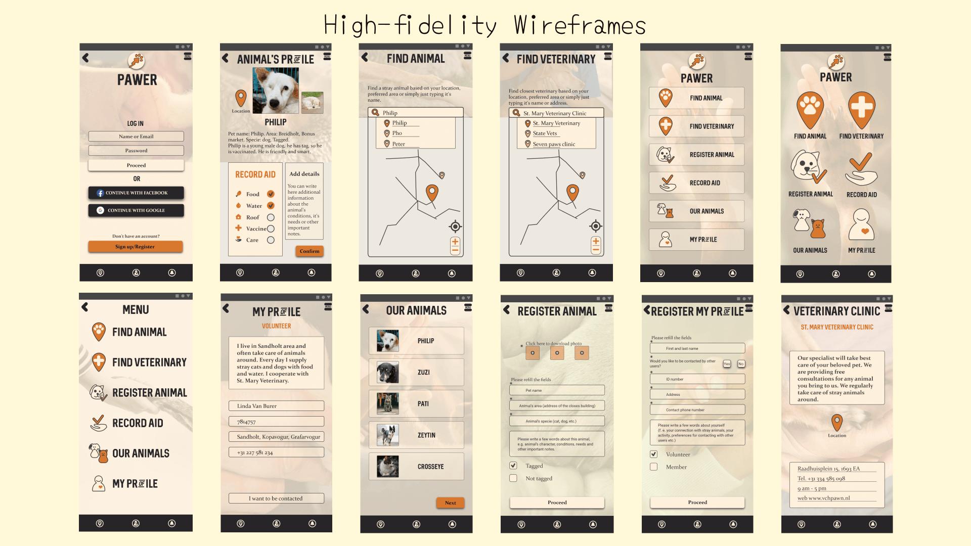
Next I incorporated the defined style into the high-fidelity wireframes, using responsive layouts and appropriate grids.
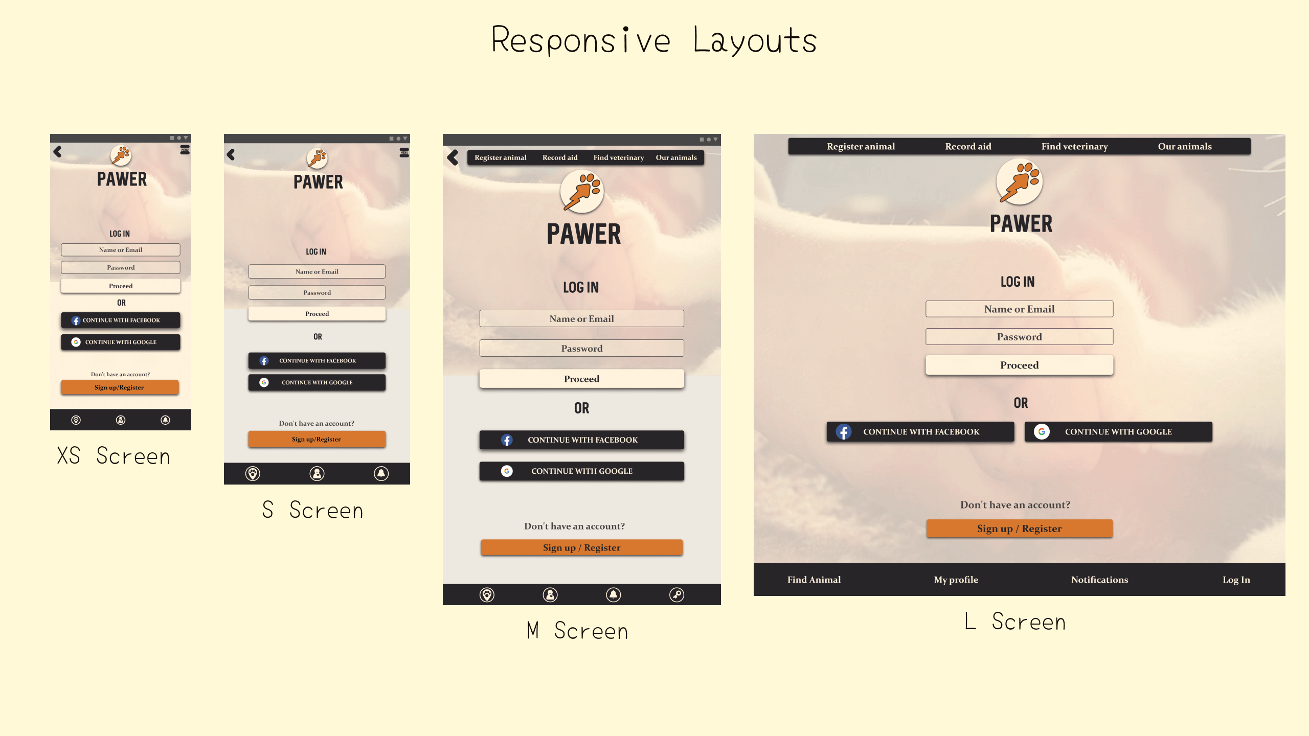
Responsive Design
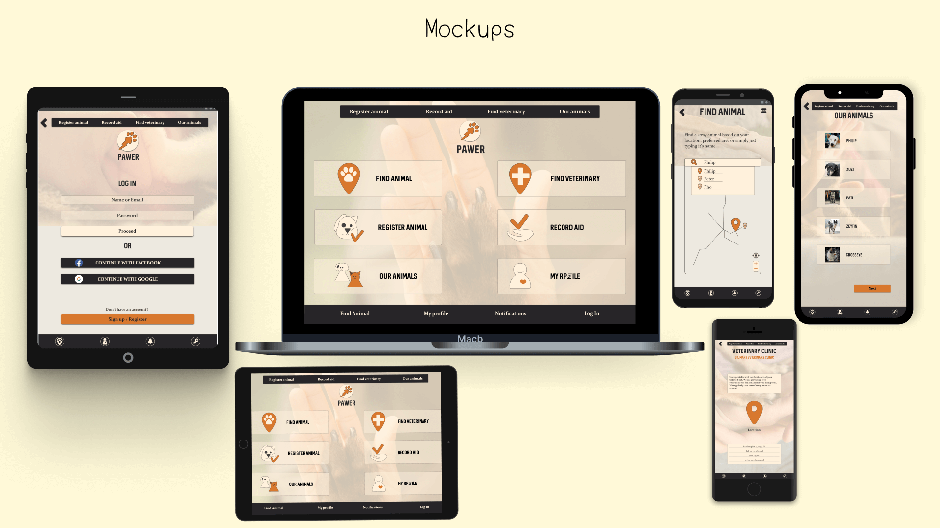
Responsive layouts allowed me to create app's variants for different devices, which actually supports the concept idea - people can use "Pawer" whenever and wherever they need!
Reflections
Went well:
Finding the concept and the idea, creating key user-flows, researching and implementing the results into the idea confirmation, using grid system and applying the responsive design.
Challenges:
Finding the “right” style, implementing the responsive design into different devices, developing UI elements and the icons.
Experience:
Practicing more responsive layouts and the design, improving a usage of the grid system, improving the usability and resolving user tasks.