"Coin"
A money-saving mobile application
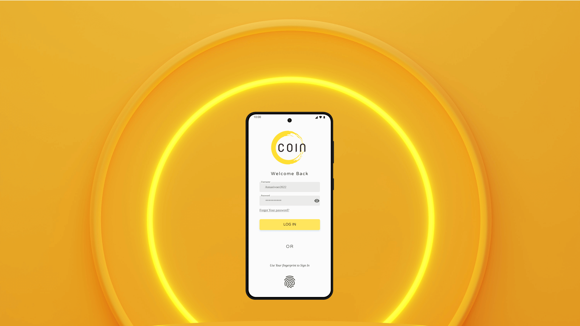
The project requirement was about creating a money-saving tool OR online-shop. I chose the first one to add variety to my experience. However, I decided to combine both concepts into a money-saving application with a small online store, where any user can buy tools for helping them to save money (piggy bank, wallet, notebooks, etc.)!
Idea
Creating a mobile money-saving tool with an online shop, offering additional features.
My Role
- Finding the idea
- Creating the concept
- Researching and analyzing
- Finding user problems and possible solutions
- Designing the app
- Prototyping
- Testing
- Iterating
- Implementing the final design
Finding the concept
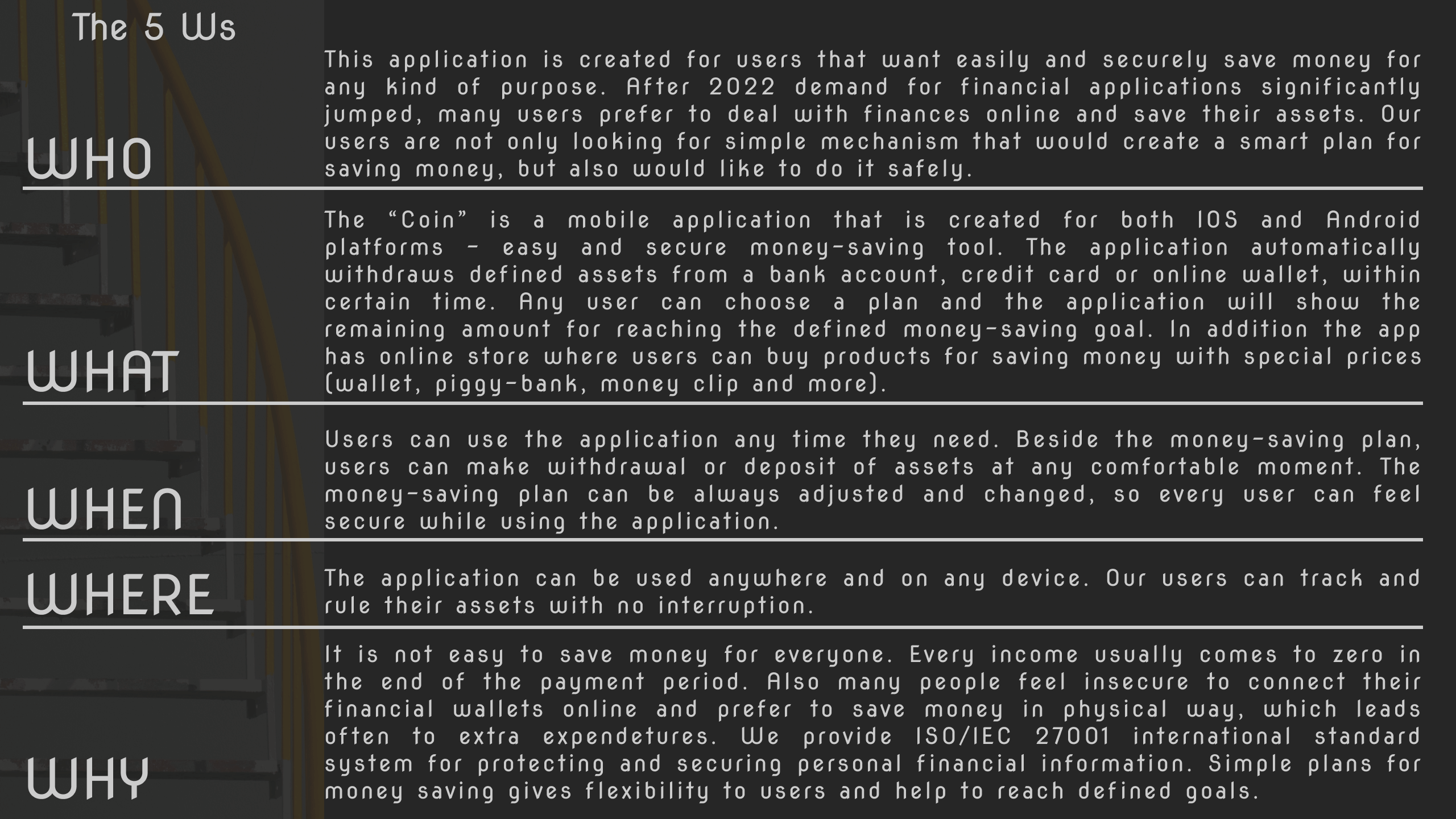
The 5W method helped to confirm the app's idea and the concept.
Design Evolution
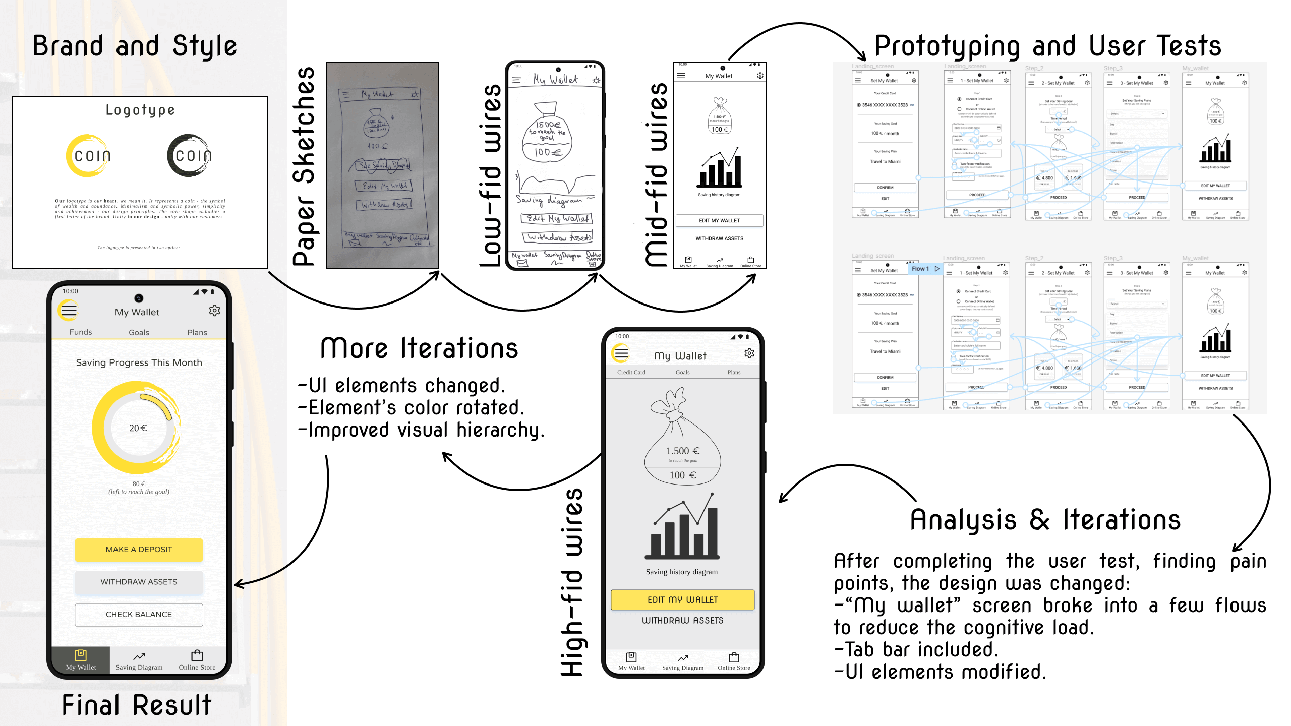
The key points of the app's development, starting with building a cohesive brand and ending with the final high-fidelity wireframes and mockups.
User Flow Diagram
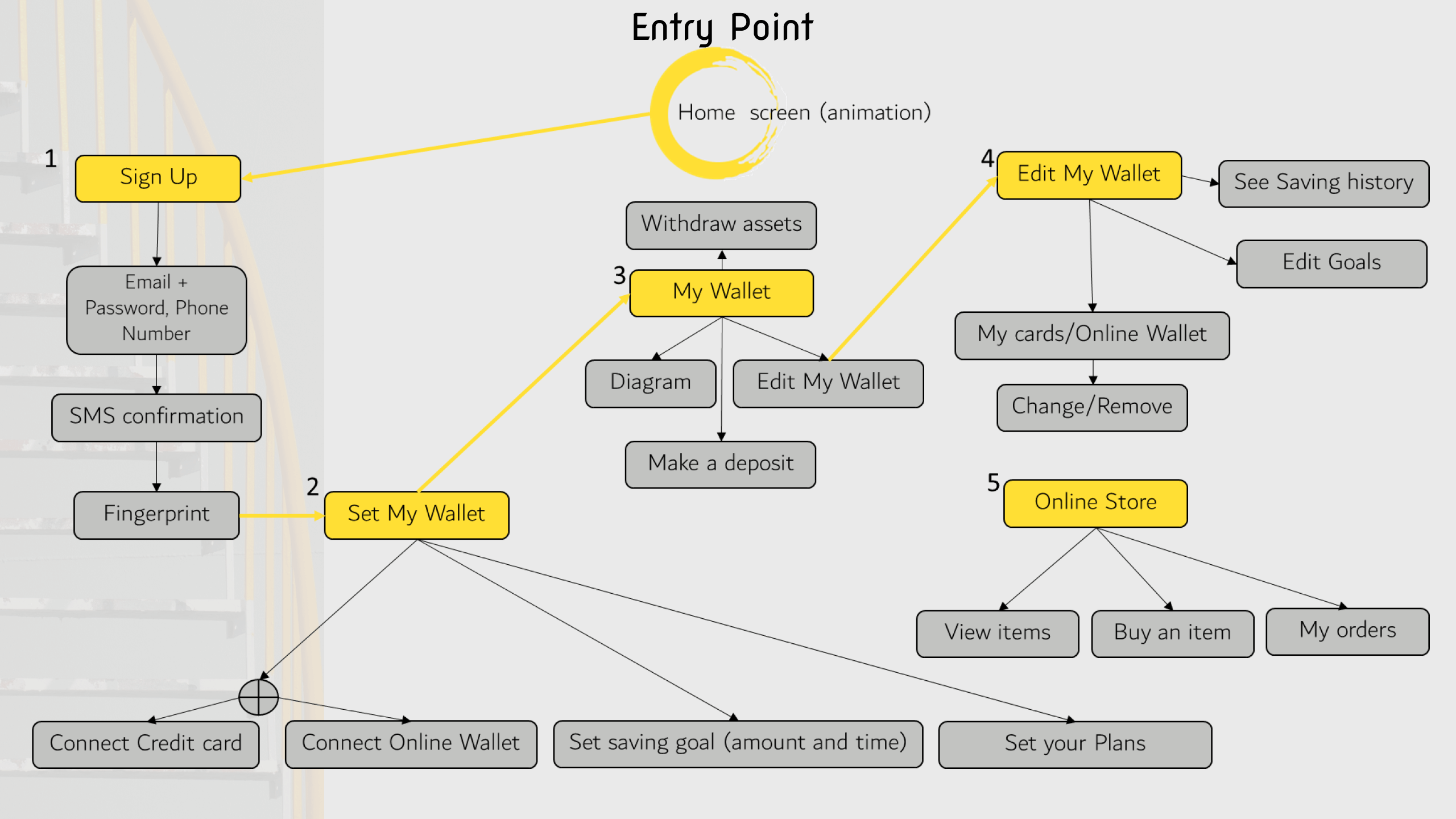
The diagram defined key user-flows. Due to the project requirements and limits, I have covered a few of the key-user flows.
Paper sketches and low-fidelity wireframes
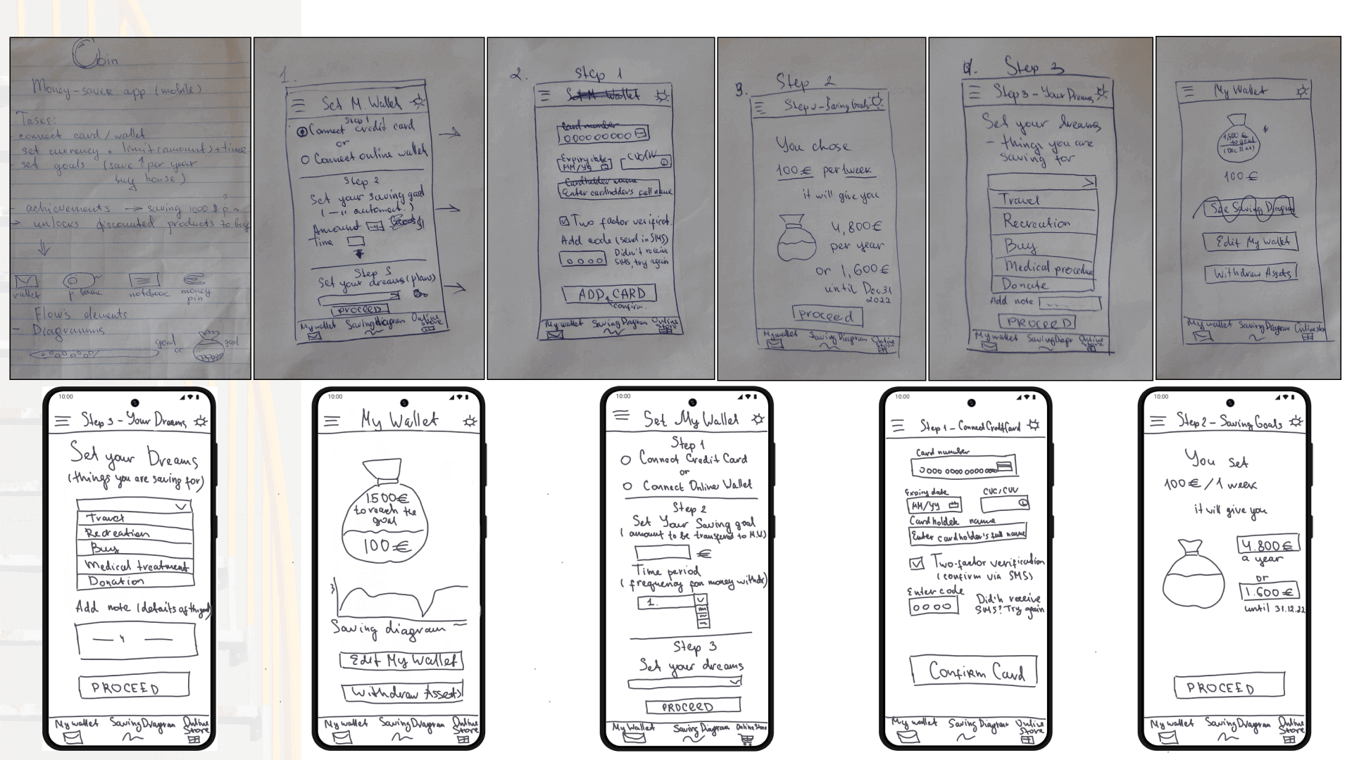
Paper sketches and prototypes, as well as low-fidelity wireframes show the user-flow tasks and the ways they can be implemented. Defined app structure was changed and iterated to ease cognitive load.
Mid-fidelity wireframes
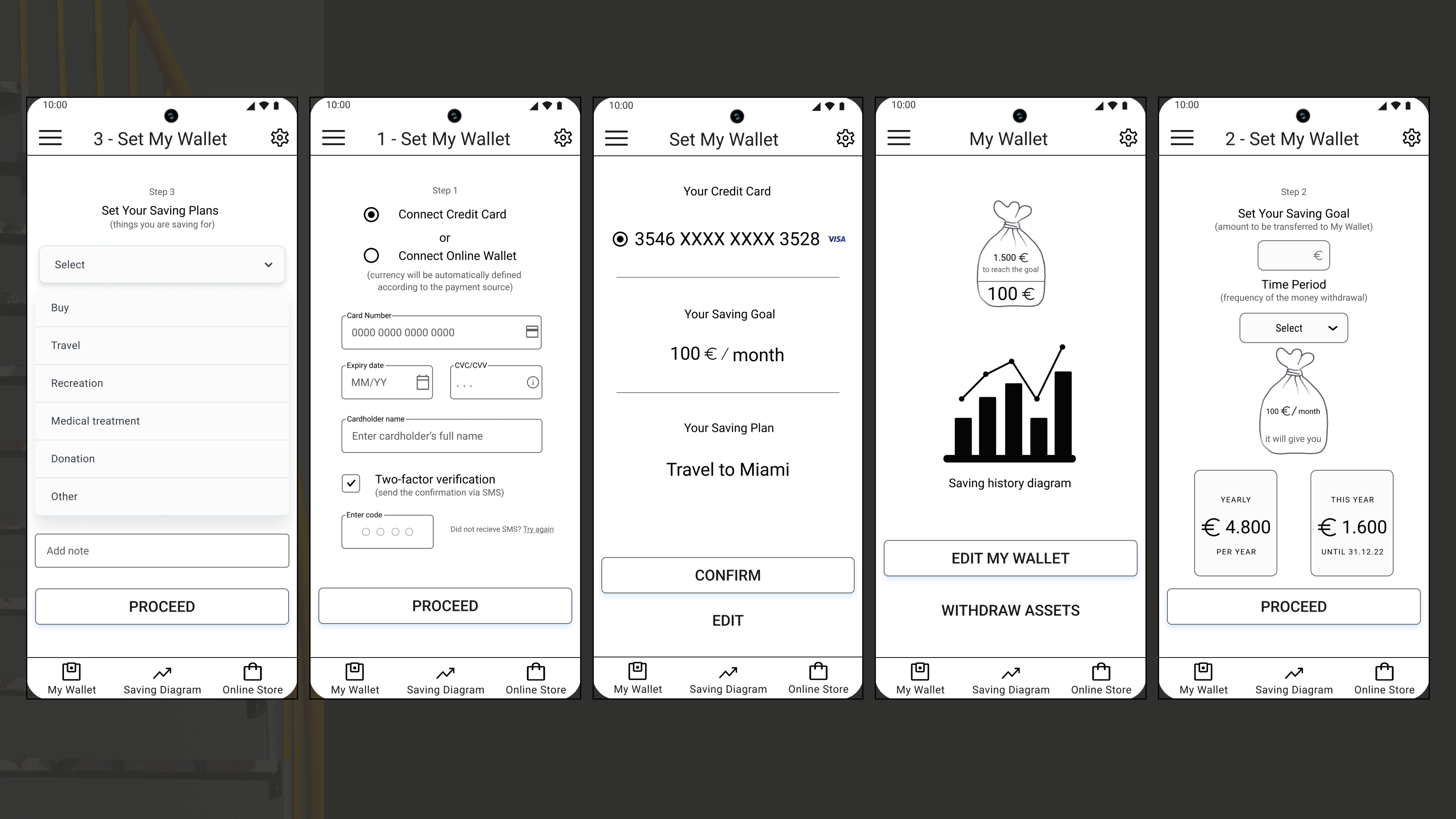
My next step in development was the iteration of the mid-fidelity wireframes. I split some of the screens to make the user's tasks clearer and easier to complete.
Building a cohesive brand and first high-fidelity wireframes
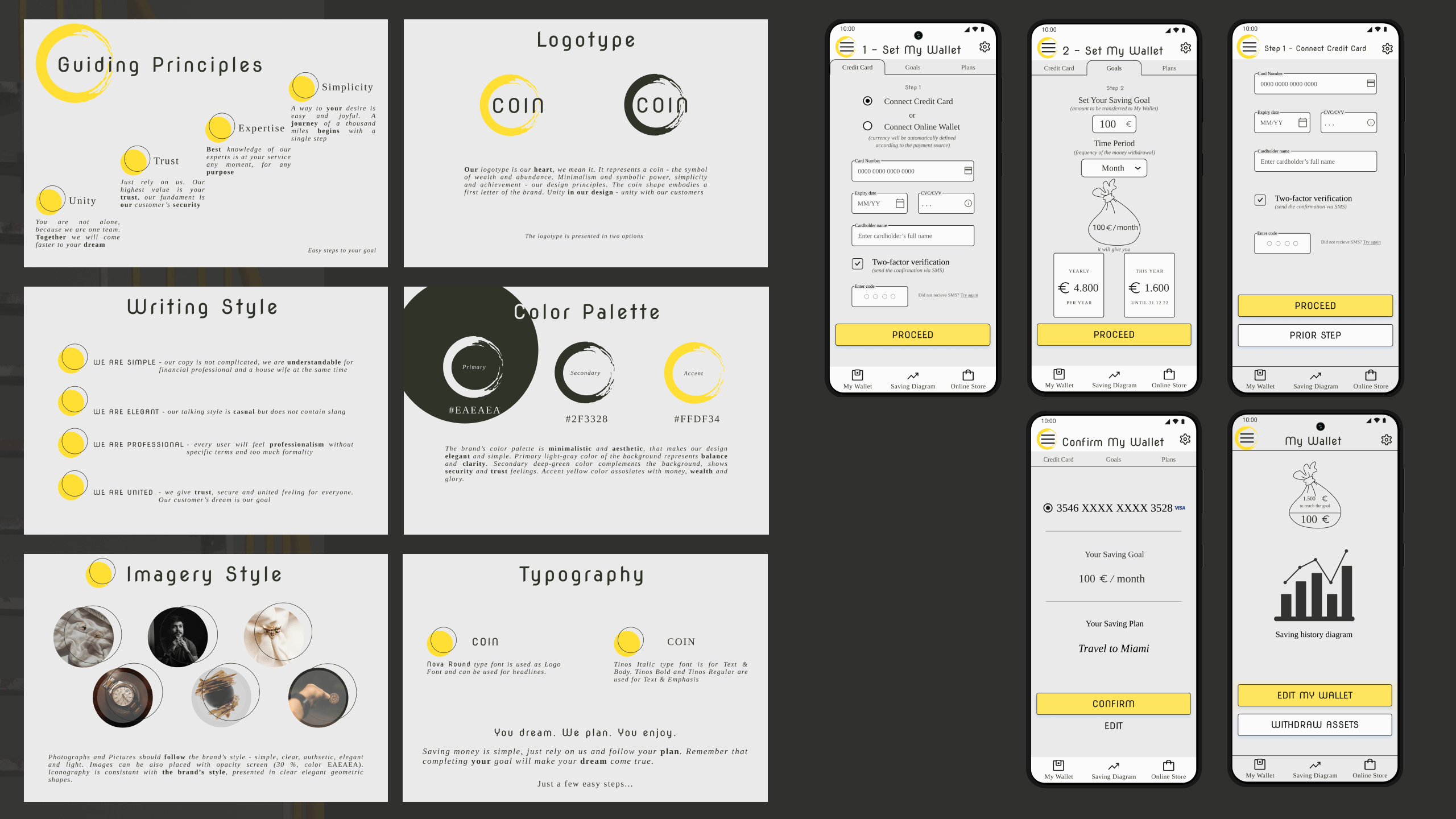
For the cohesive brand I used a light, minimalistic and elegant style. Becoming rich is a beautiful process :)! The app logo has a round abstract shape representing coin. The color palette has yellow as an accent color, representing gold, optimism, and energy.
High-fidelity wireframes after multiple iterations
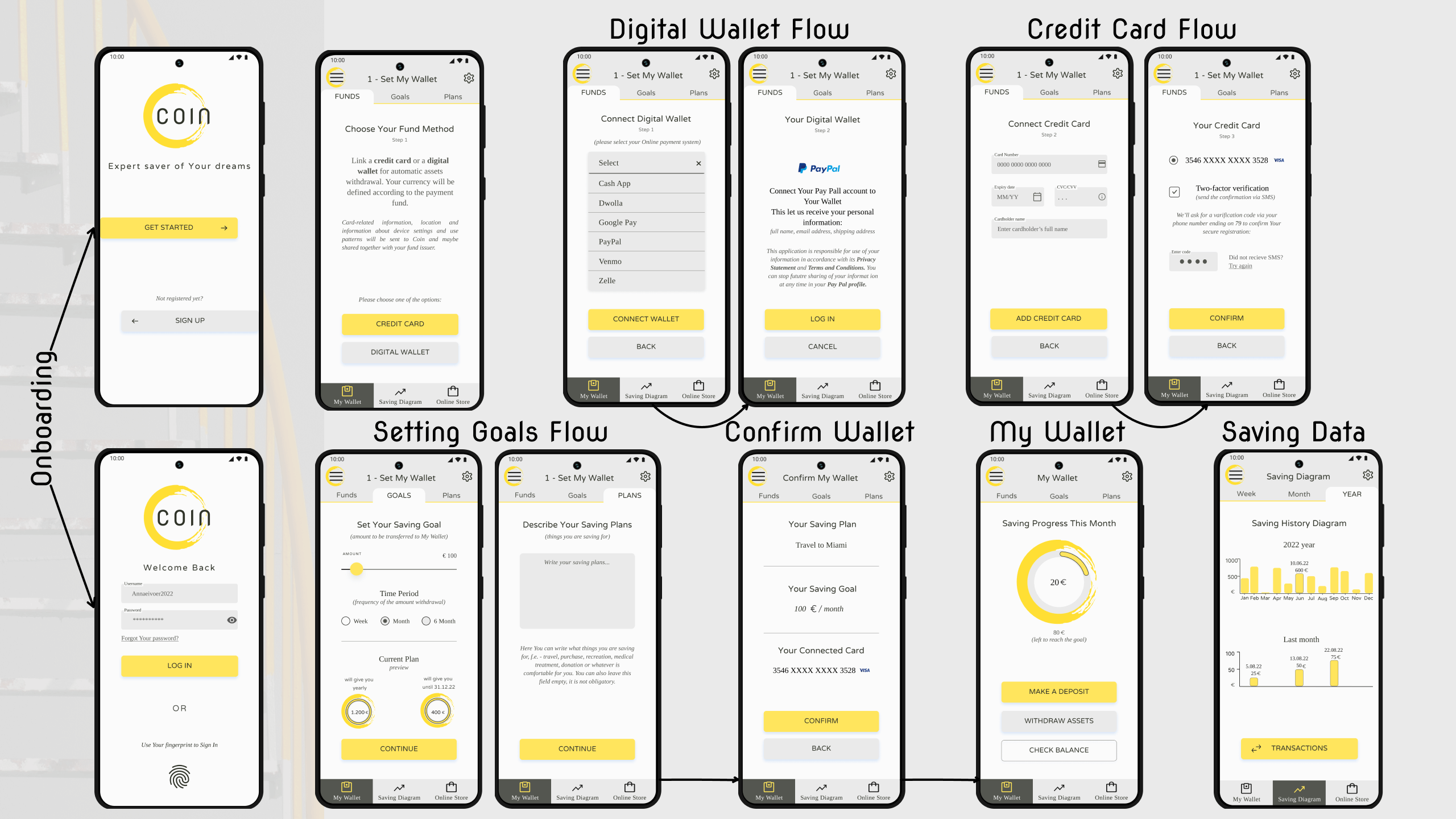
Final high-fidelity wireframes and user flows.
Desktop Landing page
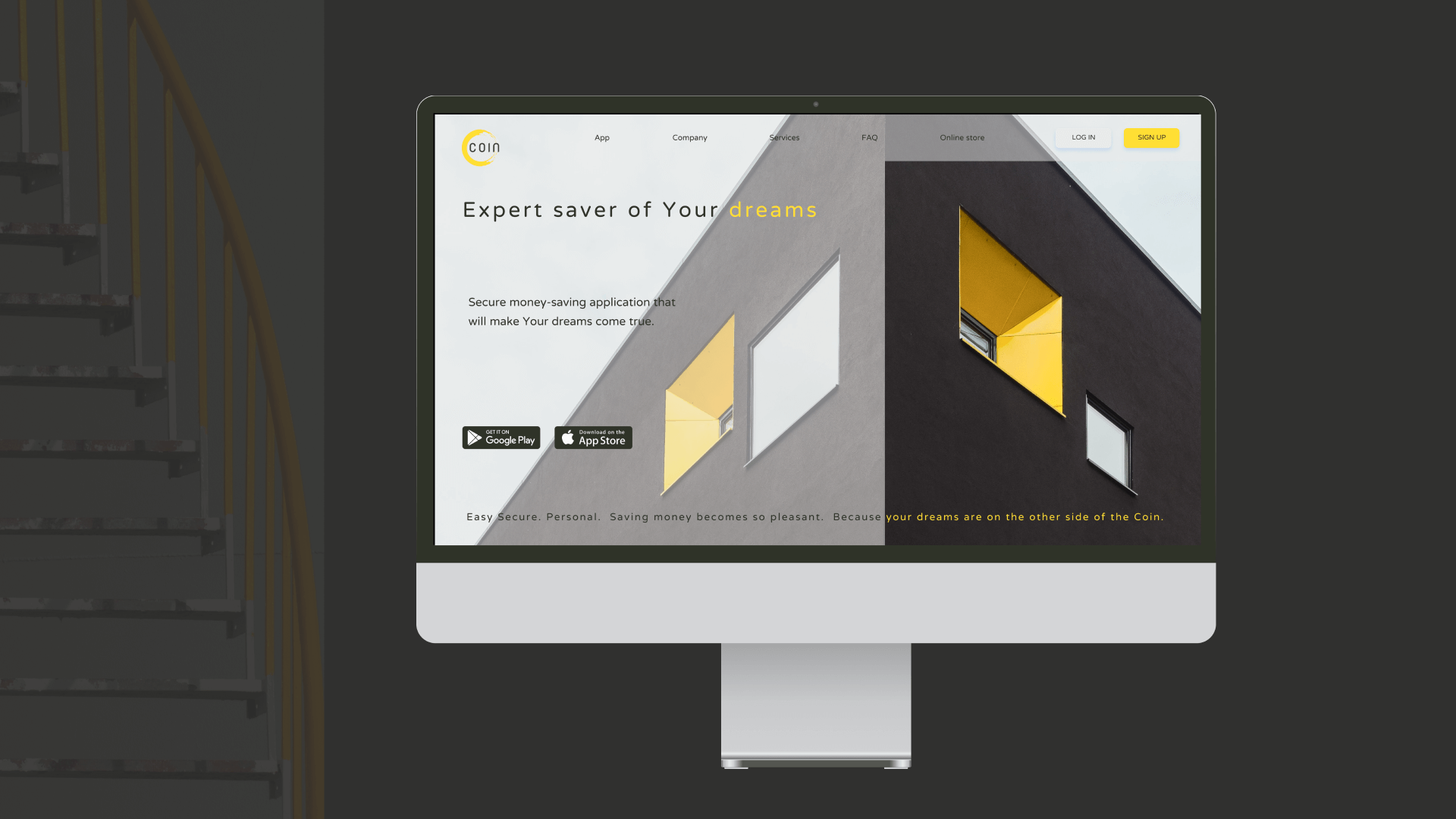
Next was the landing page design. The building picture fits the app style perfectly, supports the concept and evokes feelings of security. I used minimalistic designs, geometric patterns and light, elegant decorations.
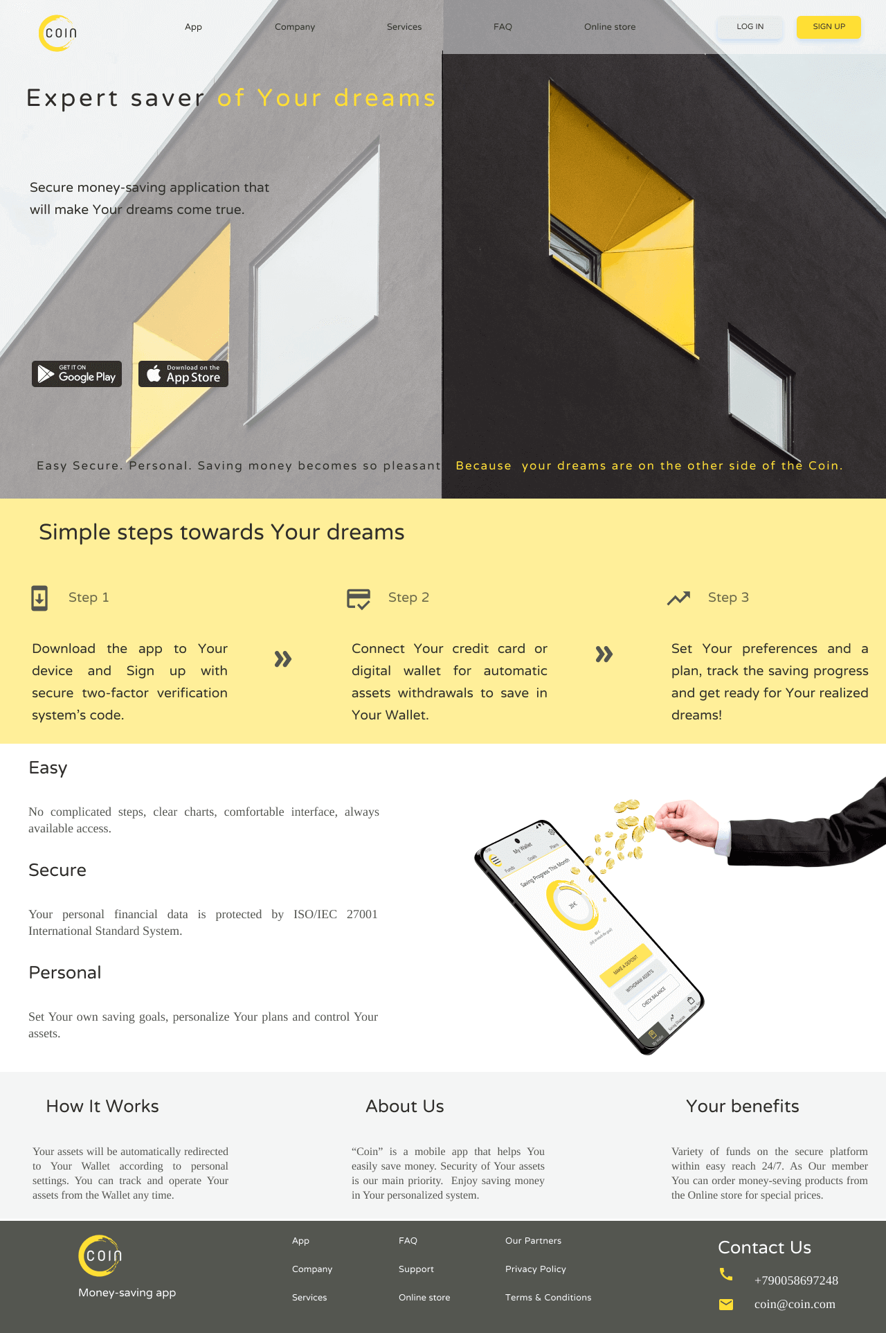
Desktop Mockup
Mobile Mockups
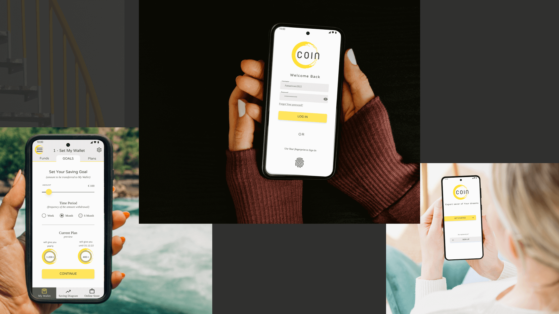
Designed mockups for this application help us to see how this application would look in the real life.
Conclusions
Went well:
Implementing the project brief, combining the ideas (money-saving and online-store app), creating user-flow, researching, generating the cohesive brand, finding the style and creating the UI elements, decorating the app, aligning with layouts and the grids.
Challenges:
Correcting the user flow, making additional screens to reduce cognitive load, choosing the key flow for screen development.
Experience and further plans:
Practice more layout, grid implementation, white space incorporation, design hierarchy and grading of UI elements.
